
There are three layers of ephemeral here:
The ripples eventually disappeared, and the surface of this lake at Trent Park went back to being perfectly still.
This book cover only existed as an option, in the end I went with Image & Other Stories, and the picture of a rose. The title of this option was too unwieldy, the colours didn’t work and the font was too fussy.
The story Stillness and Dancing is in part about the transitory nature of childhood dreams. It had a different title until I recalled these lines from Eliot’s East Coker:
So the darkness shall be the light, and the stillness the dancing
The extract from the poem features at the beginning of the story.
End
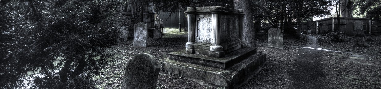
Other things ephemeral here.

There’s a lot going for this cover, I love the water photo, but you are right about the font and the background colour to the graphics is too low key.
LikeLiked by 1 person
FWIW, Ali, I can’t pinpoint it–graphic design isn’t my thing–but I agree that this cover isn’t as effective as it could be/could have been. Overall, I like the font and the photo, but, again, the formality of the font might not work with the stories. You, as the daddy/author, would know that better than I. And you can’t go wrong with “Four Quartets”; of course, I’m incredibly biased there.
LikeLiked by 1 person